About Sara Czerny

“Painting is self-discovery. Every good artist paints what he is.”
- Jackson Pollock
ARTIST BIO
Sara Czerny, born in 1983, is a watercolour and mixed media artist based in Lower Saxony, Germany. As a daughter of a skilled amateur painter, she has been in contact with art since childhood, and her instinctual understanding of aesthetics and composition has initially led her to seek career as a digital designer but it wasn’t until she got into traditional painting techniques that she eventually found her unique voice.
Her work is based on concept, symbolism and synthesis. She freely mixes media, techniques, themes and inspiration. She often reveals hidden truths and mechanisms, and brings attention to formal decisions in her paintings. She uses humour and satire as tools to expose the unpredictability and absurdity of life and nature. The presentation of the topics in her paintings is defined by honesty and openness.
Sara is constantly improving her skills by putting herself to try new, more advanced techniques, and exploring new media. Currently she is expanding her professional practice, participating in regional and international art contests, contributing to public events and small scale outdoor installations, while preparing her first independent collections.
ARTIST STATEMENT
In my works, I explore the unpredictability of life and form, the instability of perception and the ambiguity of words and meanings. I am interested in how reality is constructed through proportion, perspective, shape, light and colour, and how these structures can be exposed, bent or interrupted. I question the authority of established systems and rules just as I question so called life truths and conditioned perspectives. I like to reveal the hidden mechanisms, and naked truths, I make use of symbols and associations, often elevating them to the level of absurdity and satire. My paintings balance between humour and discomfort, control and disruption, construction and collapse. Distortion plays a central role in my work: bodies stretch, fold or rip, proportions shift, perspective gets fragmented, shadows contradict their sources. I use deformation and deconstruction as tools to destabilize what seems fixed.
I mix media and techniques freely, I believe in synthetic approach, my inspiration is both organic and constructed. I let myself be inspired by poetry, music, nature, art, emotions, theories or concepts. I often use text to fill in the missing parts of the story, drop clues or to reveal how words can be shallow and not followed by consequence. I use colour systematically to create structure and add more levels of meaning to my paintings. I often use controlled, minimalistic palletes, based on primary colours, contrasting schemes or symbolism. I do not aim to produce closed narratives, my works, even though thoughtfully detailed and often personal, remain open and welcoming to interpretation.
Gallery
-
![]()
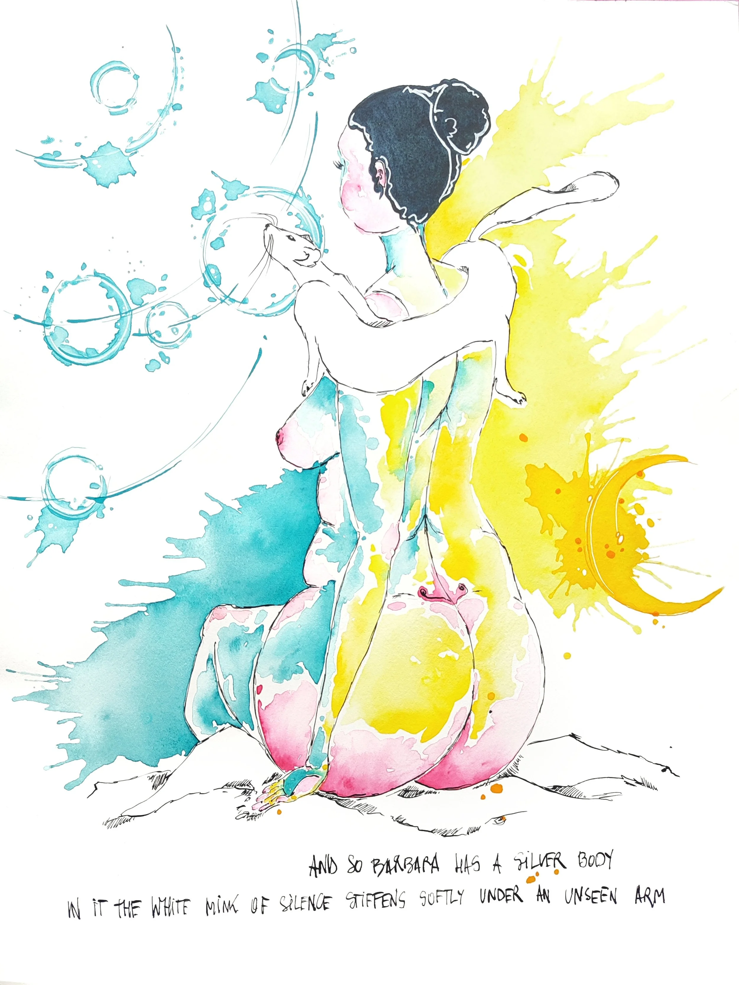
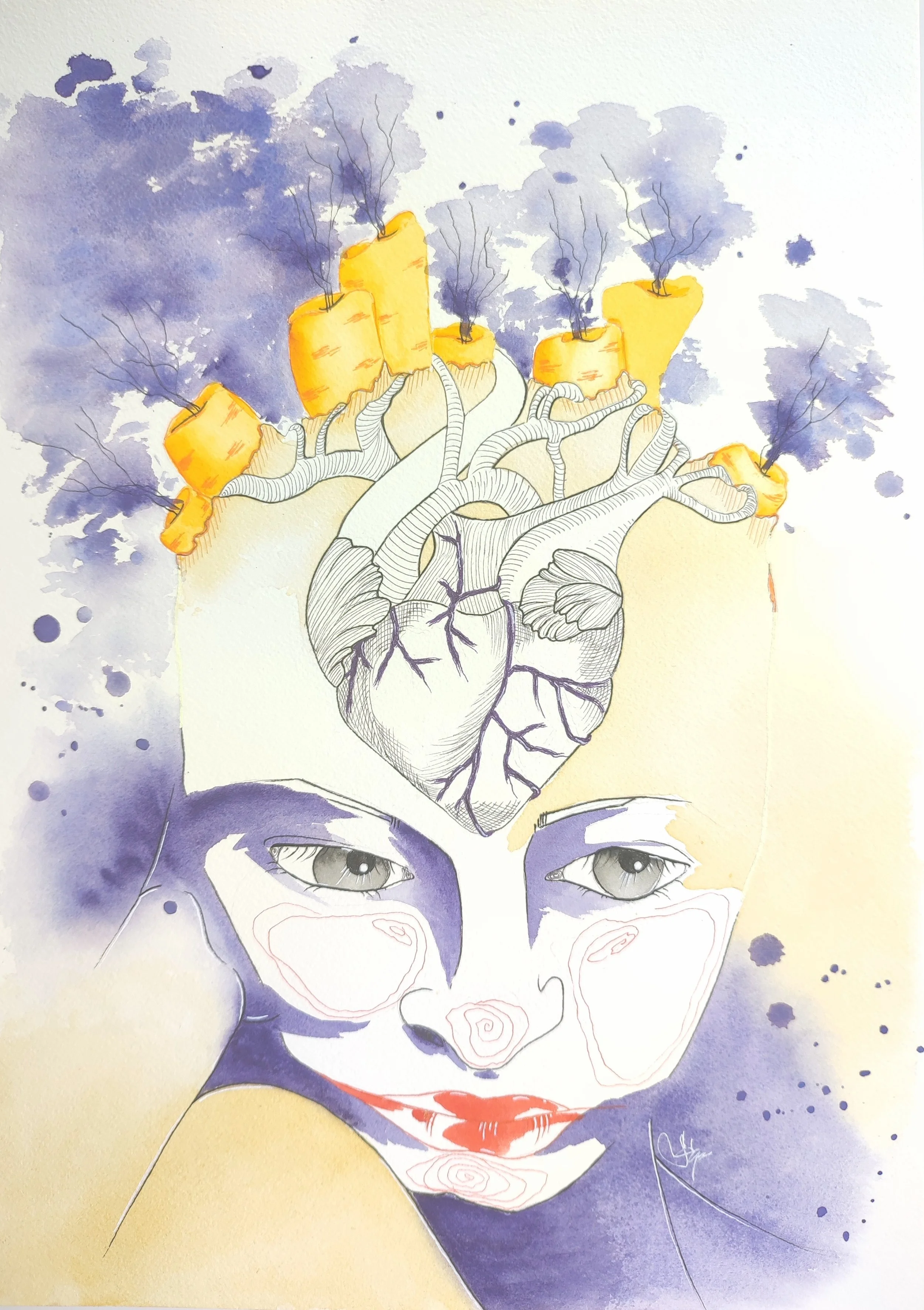
White magic
Watercolour and ink on cotton paper
36 × 48 cm
-
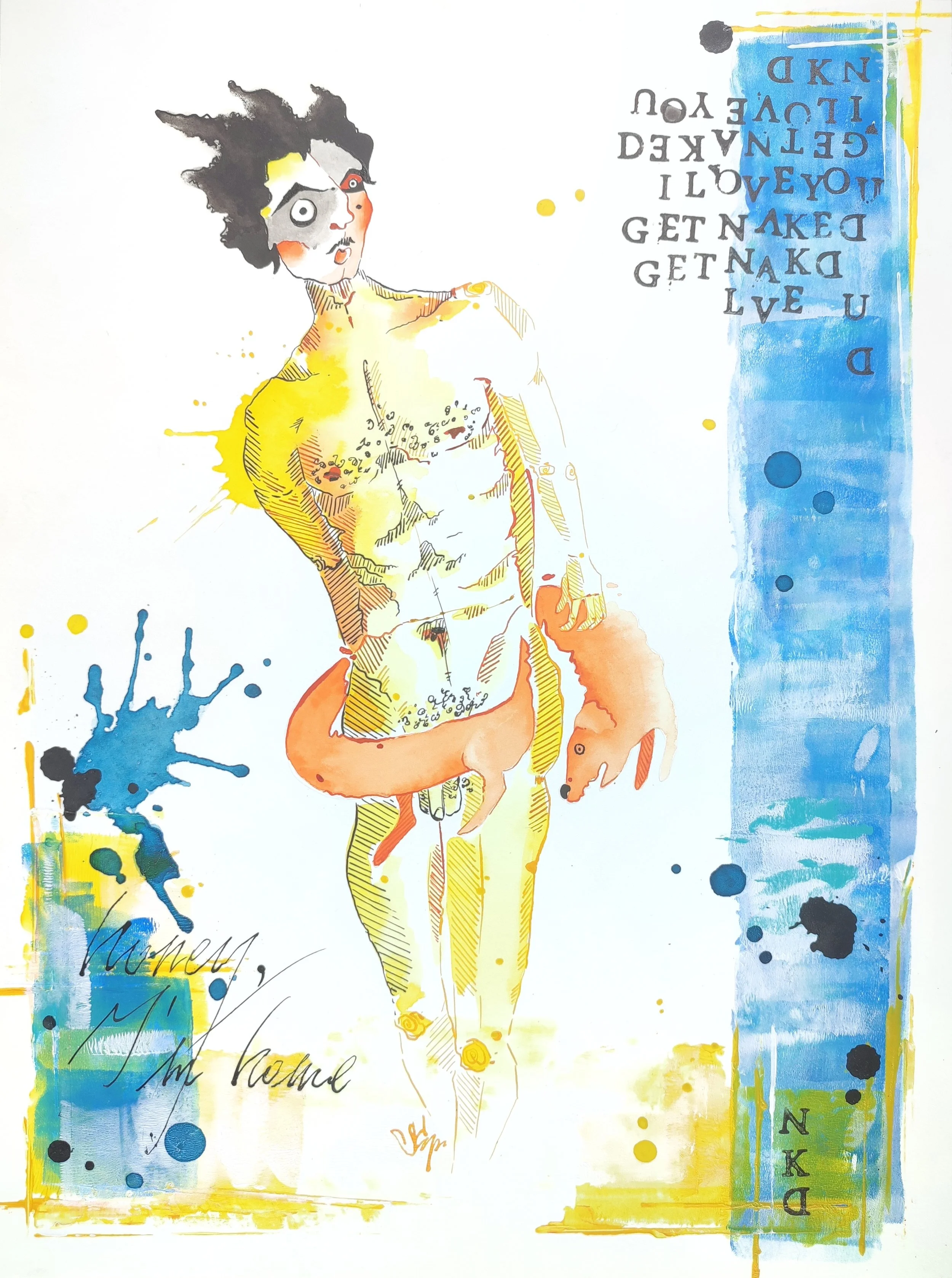
![Sara Czerny - Honey, I'm home]()
Honey, I'm home
Mixed media on cotton paper
29,7 × 42 cm
-
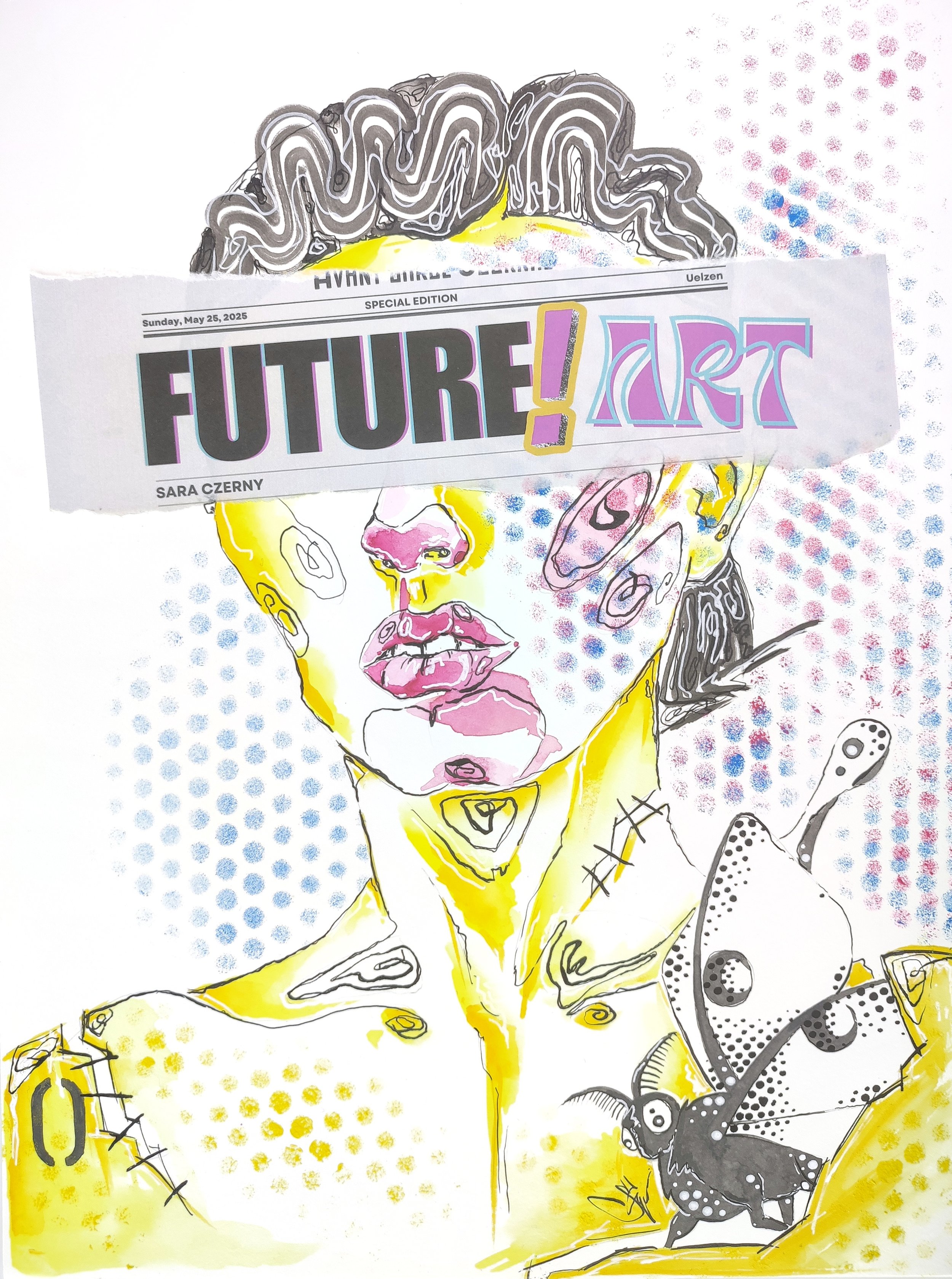
![Sara Czerny - Future Art]()
Future Art
Mixed media on cotton paper
29,7 × 42 cm
-
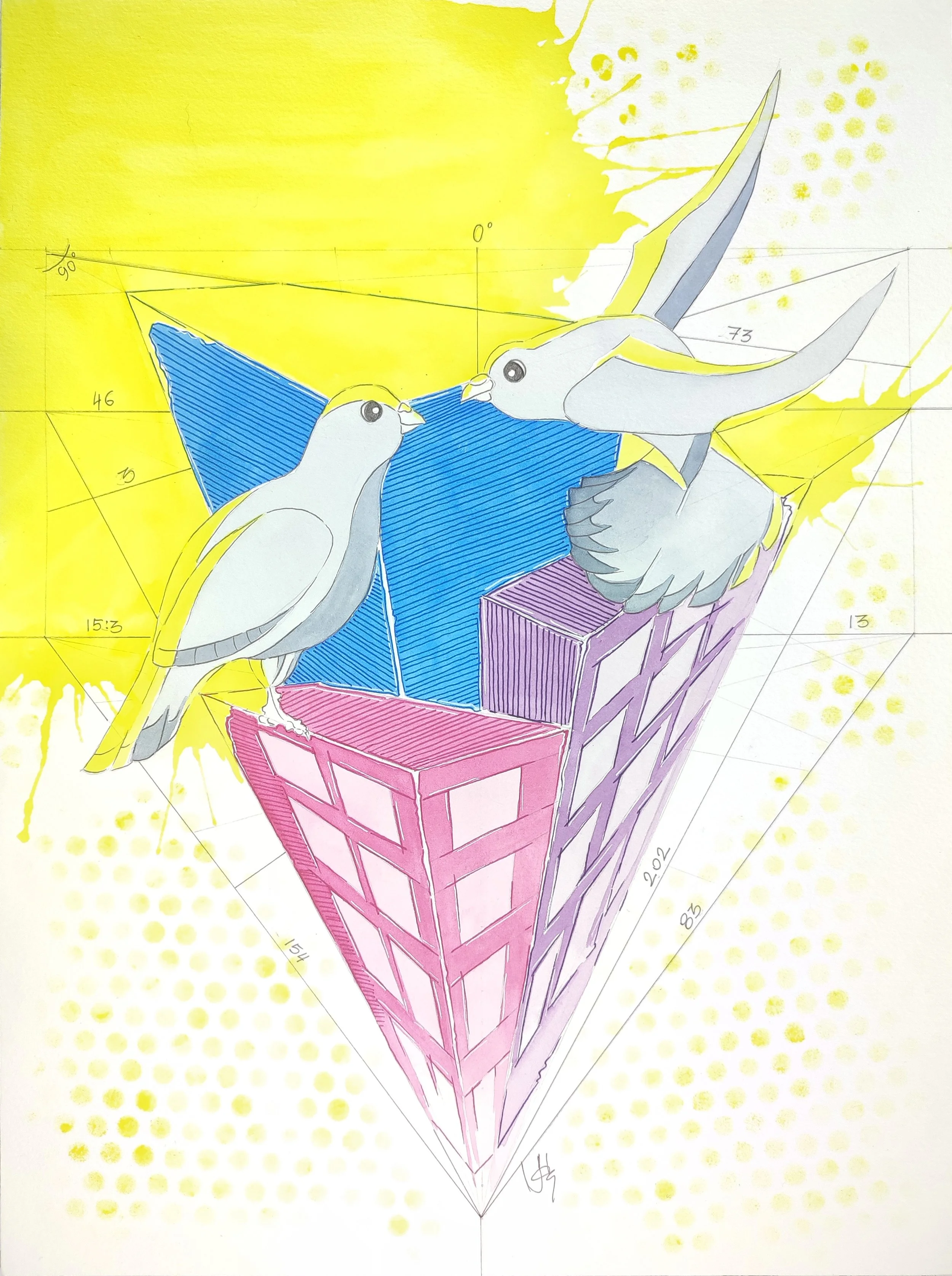
![Sara Czerny - At dawn]()
At dawn
Watercolour and liners on cotton paper
29,7 × 42 cm
-
![Sara Czerny - Karottenkopf]()
Karottenkopf
Watercolour, ink and liners on cotton paper
29,7 × 42 cm
-
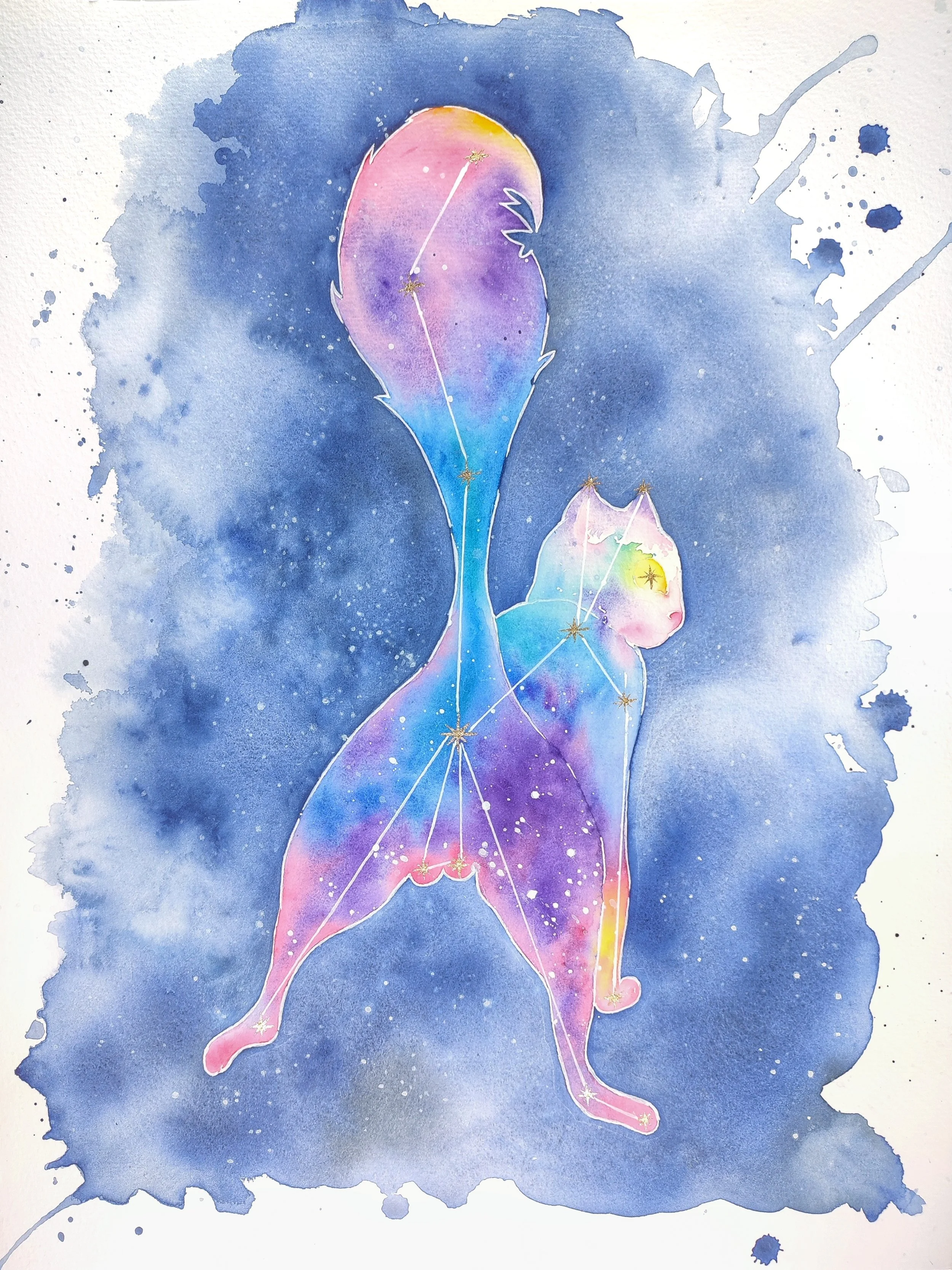
![Sara Czerny - The Cat Constellation]()
The Cat Constellation
Watercolour and liners on cotton paper
36 × 48 cm
-
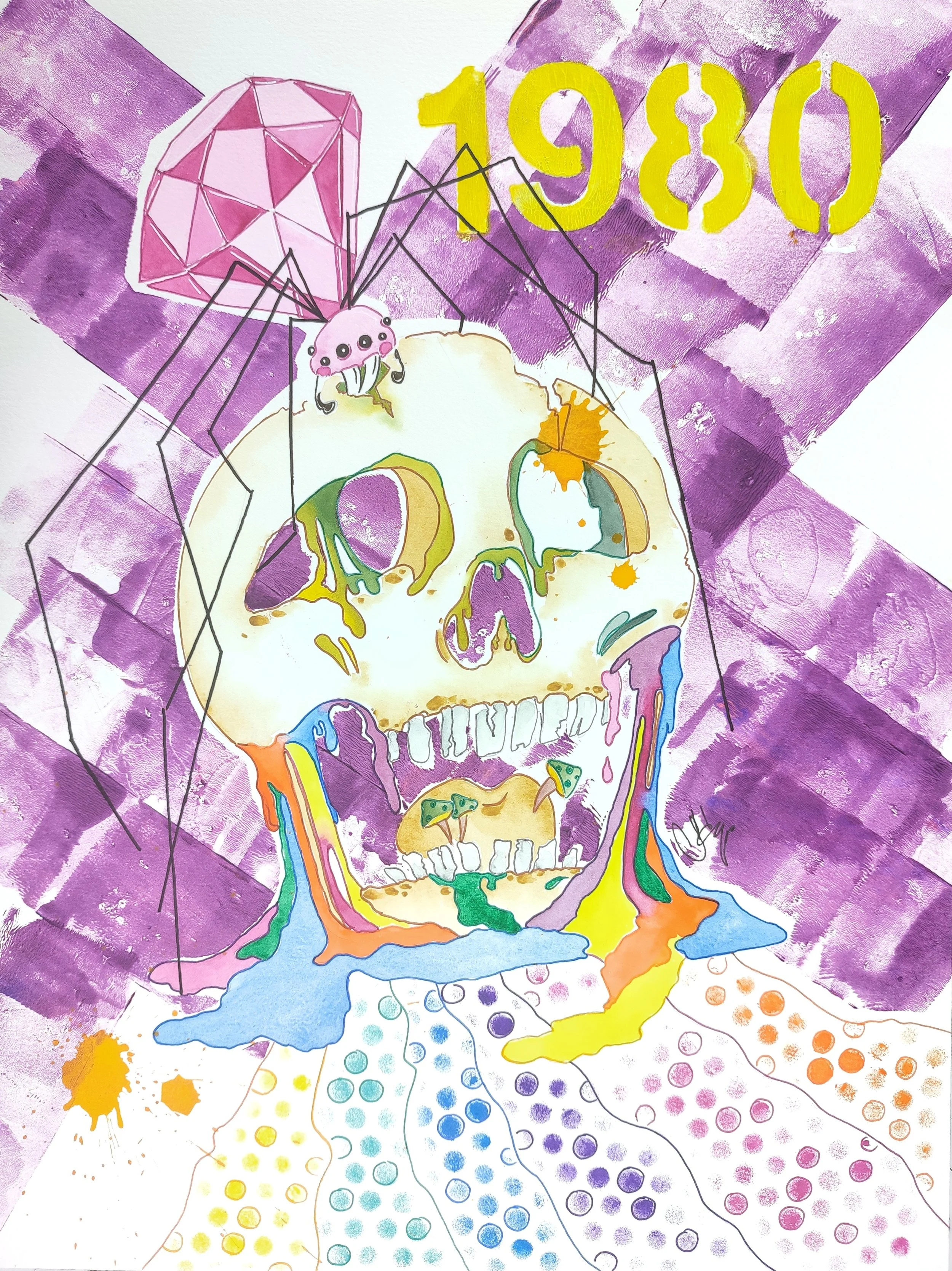
![Sara Czerny - 1980]()
1980
Mixed media on cotton paper
29,7 × 42 cm
-
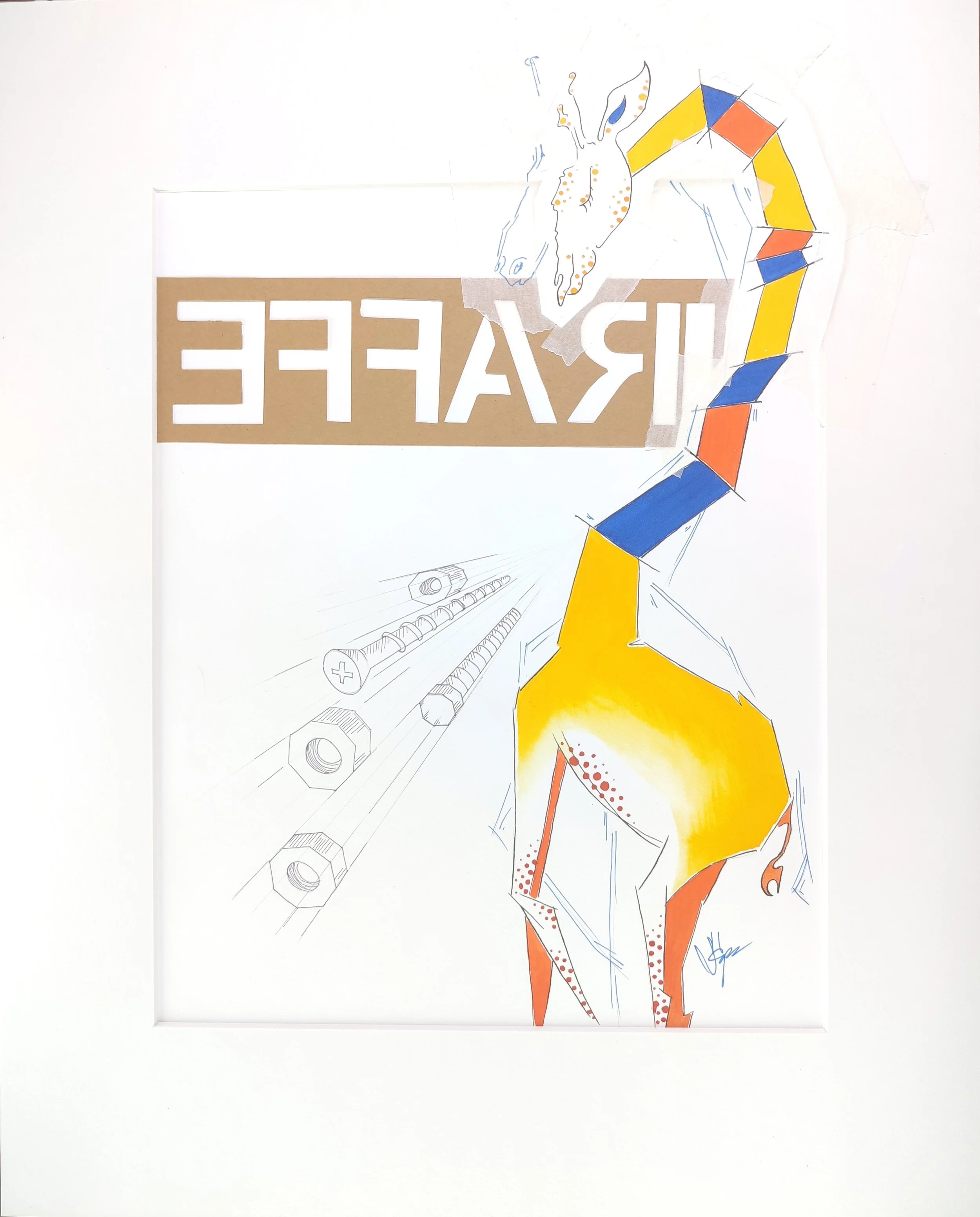
![Sara Czerny - iraffe]()
iraffe
Mixed media on cotton paper
40 × 50 cm
-
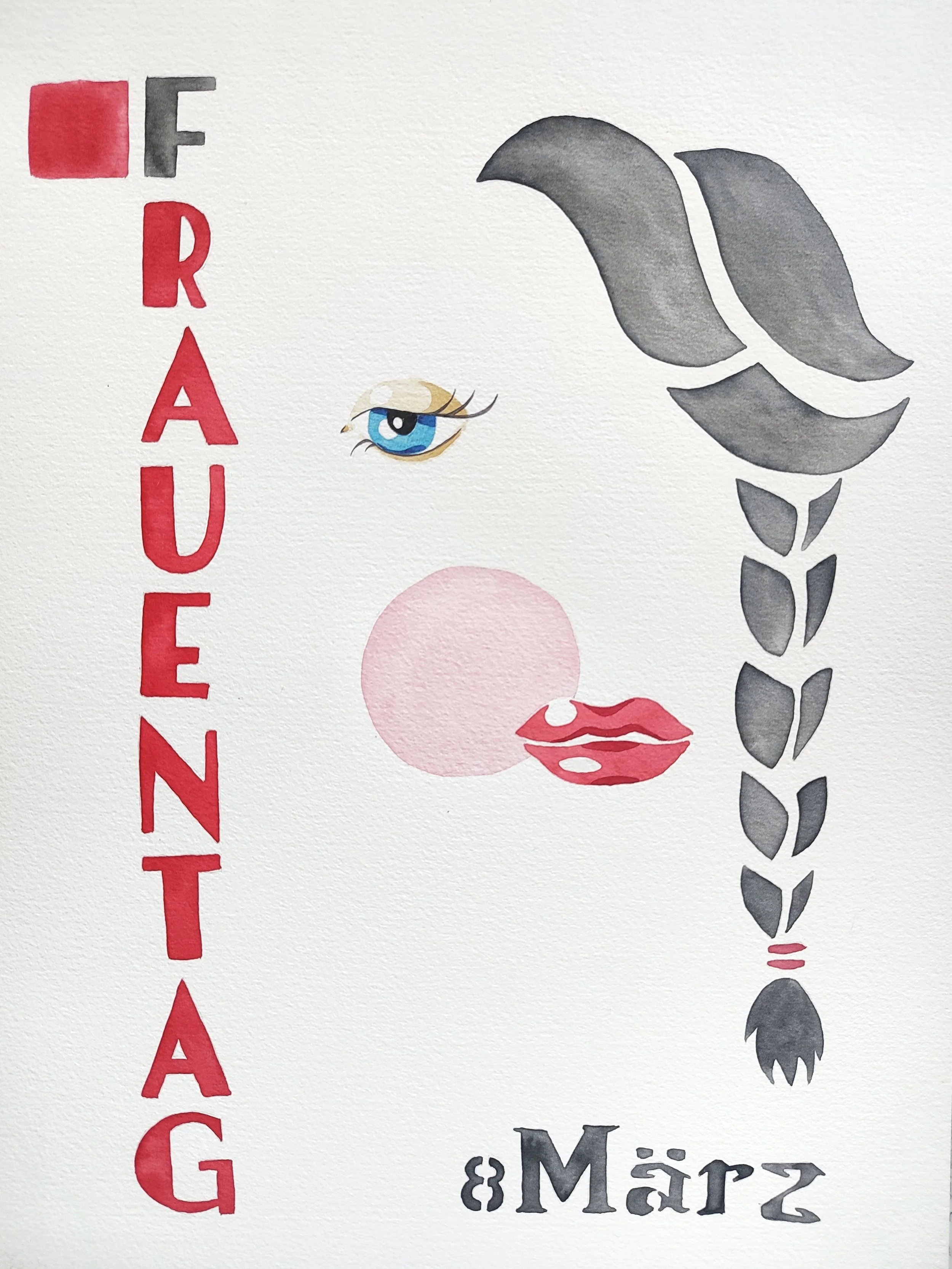
![Sara Czerny - Frauentag poster]()
Frauentag poster
Watercolour on cotton paper
29,7 × 42 cm
-
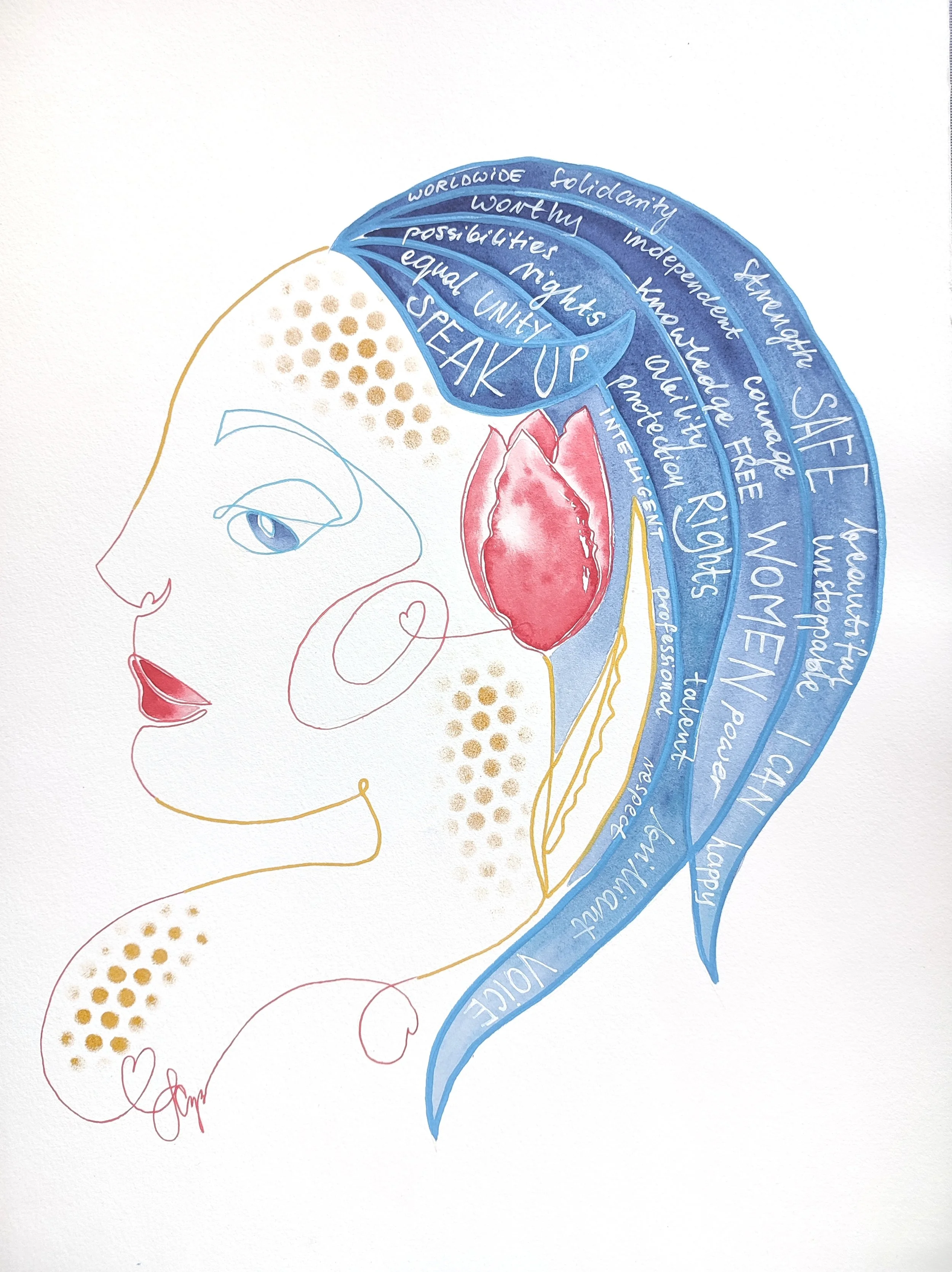
![Sara Czerny - Female Voices Festival poster]()
Female Voices Festival poster
Watercolour and markers on cotton paper
36 × 48 cm
-
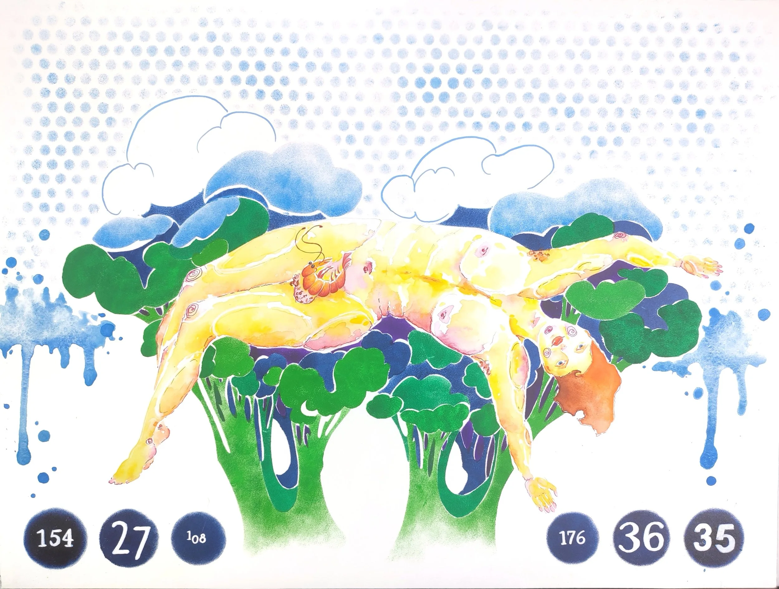
![Sara Czerny - Scampi]()
Scampi
Watercolour, ink and liners on cotton paper
36 × 48 cm
Products I use
-
I use daVinci brushes for most of my work and I love working with them.
For my watercolours I normally use: #2 and #4 french quill from Casaneo line, as well as Kolintik reservoir liner #6.
For acrylic paintings I use a set of daVinci brushes from the green series FIT Synthetics, #6 and #12 in both round and flat.
I also have a variety of supporting brushes that I use for specific effects.
-
I currently paint with a mixed brand palette that I created after much deliberation, from highest quality single pigmented colours of my choosing. It consists of paints from Winsor and Newton, Sennelier, Daniel Smith, Schmincke, Royal Talens’ Rembrandt line, and MaimeriBlu.
-
I use a variety of 300gsm 100% cotton papers including Hahnemühle, Fabriano, Arches and Canson.
My preference is to cold pressed or torchon paper for the Watercolour focused paintings and line and wash sketches. For mixed media I use hot pressed paper from the same series.
-
I also use a variety of other media and materials for my mixed techniques designs. The acrylics I use are from Royal Talens’ Amsterdam line. The inks I use are from Rohrer and Klingner and Koh-I-Noor. Some other media I use are Winsor and Newton’s Promarker, dry pastels from Sennelier, fineliners from Sakura’s Pigma Micron line as well as Winsor and Newton, and acrylic markers from Uni’s Posca line. I also keep my trusty Faber Castell automatic pencil at hand at all times.